Themes (Color Customization)
Section summary Colors are structured as 57 themes × 130 color keys in 5 categories (Standard / Lifestyle / Professional / Premium / RetroTech). The authoritative category is the
"Category"field of each theme JSON; when absent, the app assigns a built-in default. User customizations are saved as diff-only files inthemes/_custom/{ThemeName}.json— the original theme is never overwritten.
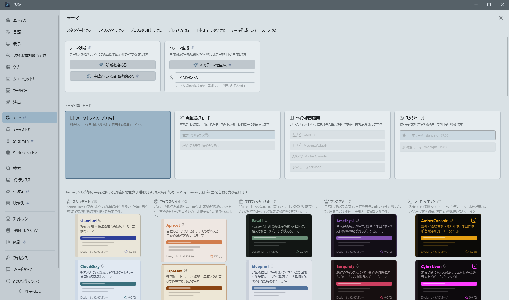
You can change the app's color theme from Control Deck (default: Ctrl+Shift+O) > "Theme." Simply selecting a theme instantly applies the colors across the entire UI without requiring a restart. The selected theme is automatically restored on next launch.
Choosing a Theme
The theme list is displayed as tiled cards.
The five standard categories (Standard / Lifestyle / Professional / Premium / Retro & Tech) are arranged as vertical columns side by side. Column width adjusts automatically to the screen width (on narrower screens the cards shrink and their descriptions wrap onto more lines, growing vertically instead), so all five categories always fit in a single row on a Full HD (1920-wide) display. Themes you created (My Themes) and themes downloaded from the store (Store) grow in number over time, so they are shown below the five category columns as full-width wrapping grids. Click a category name (with its count) at the top of the page to jump to that category.
Each card shows the theme name (bold), author, and 4 representative color chips (background, sidebar, accent, text), letting you compare color schemes at a glance.
The selected theme is highlighted with an accent-colored border.
Theme Switching Is Unlimited, Free Version Included
There is no usage limit on switching themes. All 57 bundled themes can be worn as often as you like, and tapping a tile switches immediately.
The free version used to have a daily cap. People ran into it without noticing, in one case spending a whole day stuck in a theme they could not comfortably read, so the cap was removed — rationing a headline feature was the wrong call.
Customizing a theme — editing the colors yourself and saving the result — is still a Pro feature, limited to 3 uses per day on the free version.
Theme Customization (GUI)
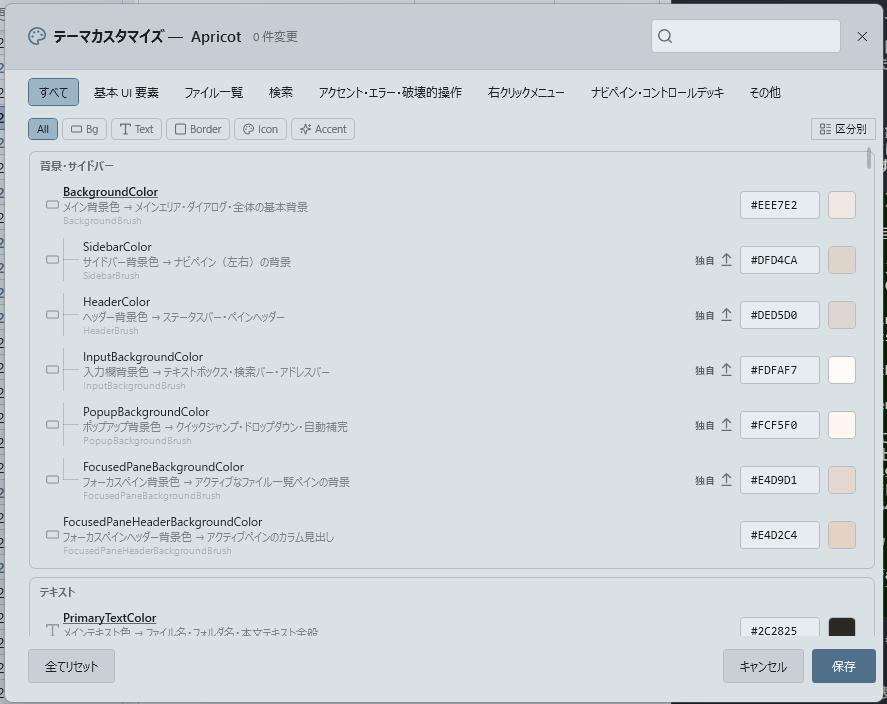
Right-click a theme card > "Customize Theme" to open a customization dialog for editing all color keys individually (free version limited to 3 uses per day).
Color keys are organized into 7 tabbed sections (Base UI Elements, File List, Search, Accent/Error, Context Menu, Navigation Pane/Control Deck, and Misc).
Within each section, color items are classified into subgroups (backgrounds, text, buttons, etc.) with group headers, making it easy to locate the color you want to adjust. Clicking the color swatch on each row opens a color picker.
Changes are immediately live-previewed, so you can verify the result before saving.
When you save, Zenith asks on the spot whether you would like to publish the theme to the community store. Answer yes and it is uploaded, ready for other people to use. You are only asked once per theme, so saving repeatedly while adjusting colours will not nag you (a fresh session asks again). Nothing appears if you have reached the day's upload limit. If you decide to share it later, you can always publish from Settings > Themes > Store.
Changes do not overwrite the original theme; only the differences are saved to themes/_custom/{ThemeName}.json. Customized themes are identified by a palette icon on the card, and right-click > "Reset to Default" removes all customizations at once.
Theme Export (Advanced)
Press the "Export Theme" button below the theme list to export the currently applied color scheme as a JSON file in the themes/ folder inside the data folder.
Edit this file with a text editor and change color codes (#RRGGBB / #AARRGGBB / color names) to create original themes. Simply adding a .json file to the themes/ folder automatically displays it in the theme list.
Editing the Description and Author fields at the top of the JSON file updates the theme list card display.
Theme Schedule Switching
Automatically switch between a daytime theme and a nighttime theme based on time of day. Select "Schedule" mode in theme settings, then configure the switching times and assign a theme to each time slot.
Automatic Updates for Default Themes
Built-in themes are automatically updated by downloading the latest versions from the store.
Theme Customization Auto-Navigation
Clicking a color item in the theme customization screen automatically highlights the UI area where that color is used. Every color key includes a "→ Used in" description.
AI-Generated Themes
You can have AI automatically generate themes. Generate theme colors from text instructions or images, preview the result, and install it. If you generate using the style-selection chips (brightness, colors, vividness, mood, scene/material), those selections are saved as tags on the theme; if you generate from free text alone, the AI's self-chosen tags are saved instead. These tags power the store's tag filter. Note that the sub color's relational choices ("Same family as main" / "Contrast with main") and the font color are not saved as tags, since they are defined relative to other colors rather than describing the theme itself.